The Global Village Coffeehouse Aesthetic
Global Village Coffeehouse, or ‘GVC,’ is the name for a network of related aesthetics that emerged in the late 1980s and peaked in the mid 1990s, fading out of the collective consciousness sometime in the early 2000s. It’s that earth-toned woodcut spiral, kokopellifigure, tribal-themed coffee shop style that never seemed to have a name, but was omnipresent nonetheless. I’ve been collaborating with others on platforms such as Facebook and Discord over the past two years to help pin down its motifs, timeline, and context. The common threads are a revival of ‘watered-down’ artistic movements, the appropriation of a hodgepodge of global aesthetics, and a reaction against the sleek, clean, synthetic, and luxurious designs of the early-mid 1980s.

Like all trends, this one stems from a confluence of socio-economic and cultural forces. Articles in design magazines from the time credit its emergence to the economic recession of the early 1990s, a shifting political climate, the resurgence of the environmental movement, and a collective feeling of shame surrounding the excess of the ’80s. Expensive metallic foils, Pacific Wave-style computer graphics, and bright Memphiscolors of the prior decade were replaced with rough, textured paper, twigs & twine as binding, and a vaguely ‘tribal,’ hieroglyphic-inspired iconography. In essence, the organic took the place of the synthetic—a visual cue that consumers in this new decade wanted to see themselves, at least superficially, as eco-conscious, spiritually-aware, and worldly.

The progenitors of the GVC aesthetic were originally considered part of the cutting edge in 1980s graphic, interior, and industrial design. Furniture by Francois Troubat, along with interiors by Jordan Mozer and Gaetano Pesce, eschewed clean Memphis forms in favor of an earthy, whimsical style. Later chains like Starbucks and Panera would mimic these qualities, replicating the same simplified motifs across thousands of stores. Design writers from the era mention how the woodcut/scratchboard print, a trend that would later come to be a dominant stylistic element of GVC, was originally seen in magazines like Wigwag, a 1989 down-to-earth counterpart to the satiricial Spy magazine. Keith Haring’s signature simple figures, motion/expression lines, and themes of human emotion and unity eventually filtered into GVC designs as well, though stripped of their political themes and re-contextualized to fit commercial applications. GVC also periodically incorporated low-brow/‘pop surrealist’ motifs, although in a more restrained, neutral manner designed not to offend or unnerve the viewer, as seen in corporate stock illustrations.

The rapid acceleration of globalization in this era also contributed to aspects of GVC design, as it heralded a new wave of imperialism in the form of corporate exploitation of ‘emerging countries’ and global cultures. In the 1990s, Western nations developed a fascination with various global cultures through their increasing visibility in media and consumer products. This was embodied in the buzzwords of the era: ‘new age spirituality’, ‘world music’, ‘tribal’, and ‘global fusion cuisine.’ This overall zeitgeist manifested itself in the appropriation of iconography previously associated with both ancient and Indigenous cultures. In addition, imagery that had previously been associated with the first wave of European colonization—such as Mercator globes, compasses, rigged ships, maritime wheels, heraldic suns and moons—was given a simplified, stylized, and rougher treatment. This particular strain of GVC also generated designs that are problematic in hindsight: ‘globalization gaze,’ tribal figures shown carrying executives, serving coffee, or holding up a stool accompanied by the caption, “designed for those who hanker for the days when porters took the load off their feet.”
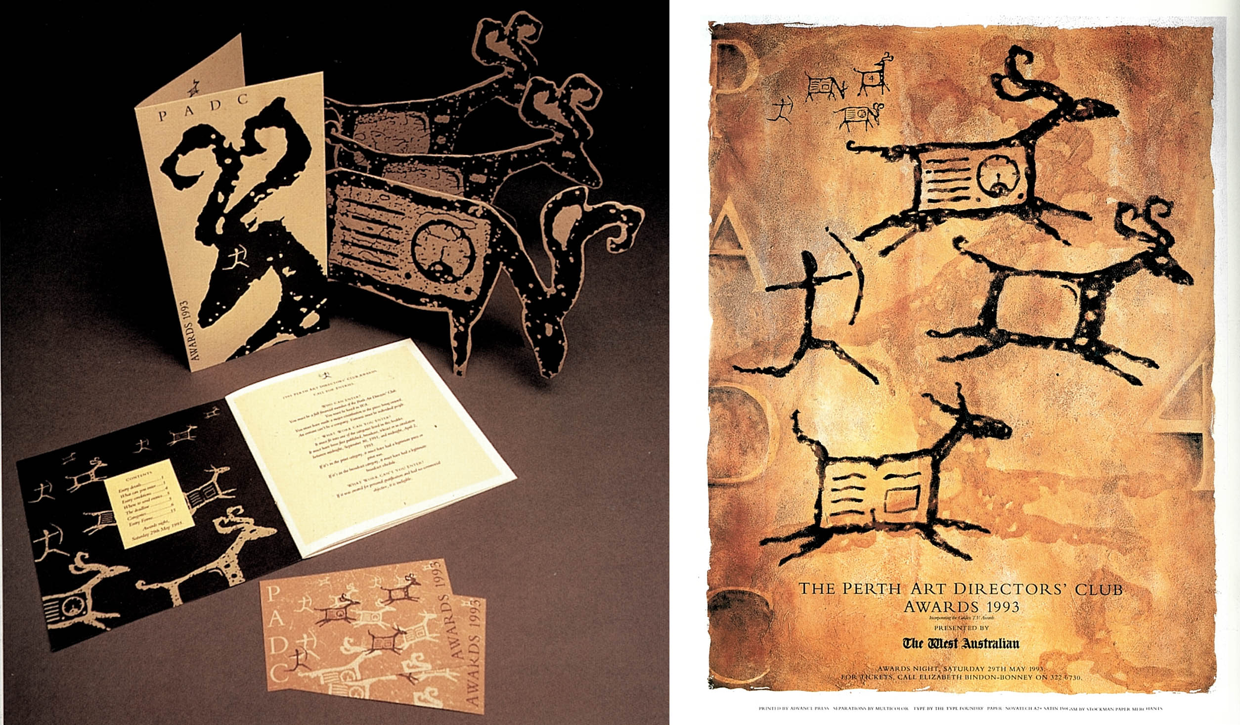
The rise of the Internet was crucial to this notion of a unified ‘global village.’ It led to the ephemeral GVC sub-trend of ‘neo-hieroglyphics,’ seen in the early iterations of Wired Magazine’s website, countless 1990s font packs, Lascaux-inspired imagery, and the work of various graphic & multimedia designers. While the the intent of some of these experiments was to develop a more universal language that could transcend physical borders, most (as was the case with Wired) appear to be merely capitalizing on a trending aesthetic. These fonts and simplified iconography were then applied to contemporary objects, spaces, events, routine tasks, and business practices in an attempt to lend them a sense of spiritualism and deeper meaning through association with the earliest forms of human communication.
The second wave of the environmental movement, beginning in the late ’80s, fueled a rise in ‘greenwashing’ and the superficial application of natural motifs to product and packaging design. Products staged in wooden crates overfilled with straw as packing material; papier-mâché menus with deckled edges and a single twig; and ads touting different varieties of textured recycled paper abounded. These products often featured GVC tribal/native motifs in their graphic design in an attempt to associate their products with cultures seen as more ‘in touch’ with their natural surroundings.

I’ve found that one of the most interesting aspects of GVC is not the aesthetic itself, but that we’ve collectively forgotten how prevalent it once was in the design world. Going through Print magazines’ Regional Design Annuals from 1990-1995, GVC motifs are present in designs across a wide range of scales and clients, from branding for a small pottery shop in California to the 1993 Starbucks Annual Shareholders Report. Living in Seattle, one of the epicenters of GVC culture back in the ’90s, I’ll find remnants scattered throughout the city, slowly being erased without fanfare. When showing others GVC, a common reaction is a mix of embarrassment, nostalgia, and a sense of unease stemming from the underlying issues of cultural appropriation, the failed predictions of the harmonious ‘global village,’ the romanticization of colonialism, and the dark legacy of neoliberal globalization. It’ll be interesting to see whether GVC will be acknowledged or revived in the future, since as of yet it seems to be excluded from the general consensus of the ‘90s look’.
Evan Collins is an architectural designer and design researcher living in Los Angeles, CA. For the past decade he’s been working with a collective of others on the Consumer Aesthetic Research Institute (CARI). CARI is an online community dedicated to developing a taxonomy of recent design aesthetics in modern consumer culture, interpreting and critiquing them in the context of societal trends.